foobar2000:Title Bar (dotnet_title_bar)
| Title Bar | |
|---|---|
 dotnet_title_bar | |
| Developer(s) | Quiark; LepkoQQ; TheQwertiest |
| Repository | GitHub |
| Release information | |
| Stable release | 2.0.0 (October 10, 2021) |
| foobar2000 compatibility | |
| Minimum version | 1.3.17 / 1.4 |
| UI module(s) | N/A |
| Additional information | |
| Use | UI |
| View all components | |
dotnet_title_bar is a component which displays the currently playing song on the top of the screen (something like Winamp's WindowShade Mode). The .NET Component Host component must be installed to be able to use it.
It supports custom-made skins and is written in C# (with some C++/CLI for binding to foobar2000).
Originally developed by Quiark and then forked by LepkoQQ[1], development was later picked up by TheQwertiest[2].
Contents
Features
- Heavily customizable UI
- Configurable automatic show/hide of title bar, including:
- On first N seconds of the song
- On last N second of the song
- Only when not playing
- Manual trigger from keyboard shortcut
- Fading in and out on mouse-over.
- Configurable opacity.
Gallery
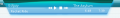
First skin

Second skin
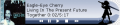
Second skin
Usage guide
Prerequisites
- Microsoft .Net Framework 4.5 (https://www.microsoft.com/download/details.aspx?id=42642)
- foobar2000 v1.4+
Installation
- Download the latest release.
- Extract and install foo_title.fb2k-component (How to install a component).
- Open folder for skins (Preferences > Display > foo_title > Main > Open directory).
- Extract directories contained in 'skins' folder to the opened folder.
- Check out and download user-created skins.
- Choose and apply your preferred skin.
Additional instructions
Preferences page
Main

- Show Popup: this box only affects behavior of the enabled foo_title, i.e. when Main > Enabled is set to Always or When foobar2000 is minimized with fb2k minimized.
- Always - foo_title is always displayed. When one of the triggers is called (see Popup Triggers below) the opacity of the foo_title is changed to the value from Advanced > Opacity on trigger.
- On trigger - foo_title is displayed only when triggered. All the remaining time it's not visible and is not interactable.
- Popup Triggers: this box is used to enable or disable triggers, that affect the appearance of the foo_title. Mouse-over and Peek foo_title keyboard action are also considered a trigger.
- Popup Peek: used to set the delay before foo_title is hidden (see Keyboard Shortcuts for more info).
Advanced

- Max Refresh Rate: foo_title is only refreshed\redrawn when it is needed, but in some complex skins there might be a lot of such calls, resulting in lots of redraws and high CPU usage. This option limits the maximum allowed redraws per second to avoid the issue. The value can be further reduced for reduced CPU usage or further increased for more fluidity.
- Dpi Scaling: when enabled, foo_title will scale the skin according to system DPI settings. All images in the skin will be stretched, if required.
- Anchor Position: see Header Section for more info.
Keyboard shortcuts
foo_title contains the following functions that can be mapped to keyboard shortcuts (Preferences > Keyboard Shortcuts > Action):
- Toggle foo_title : calling this one is equal to toggling between Always and Never in Preferences > Display > foo_title > Main > Enabled.
- Peek foo_title : causes foo_title to show briefly with full opacity (see Popup Triggers). The time before fade-away can be configured through via Main > Popup Peek.
Skin format description
foo_title UI is defined by the selected skin.
Skin consists of main skin.xml file, that contains skin's description, and various resources that are used by skin.xml. All these are placed inside skin's directory: [foobar2000 installation folder]/foo_title/[skin folder]/.
Skin supports all the image formats that are supported by the .NET framework itself - that is bmp, jpg, png (for transparent images) and perhaps more.
Header
You must start your skin with a header like this one:
<?xml version="1.0" encoding="utf-8"?>
<skin
   author="[name of the author of the skin]"
   name="[name of the skin]"
   width="[width in pixel]"
   height="[height in pixel]"
   anchor="[anchor type]"/>
anchor::== left | right | top | bottom | center | ... | comma-separated combinations | ... | [top,left]
The size of the skin can be overstepped as the size is adjusted automatically.

Anchor is used to pin specific point of skin to display. When skin size changes, anchor stays on the same place (relatively to display), meaning that the skin will expand or contract only in non-anchored directions. The position of the anchor can be displayed via Preferences > Display > foo_title > Advanced > Anchor Position > Display anchor.
Layer
A layer is an element, a kind of container. Layers can be nested or placed consecutively.
The global structure of layers is as following:
<layer name="[layer name]" type="[layer type]" tooltip="[tooltip text]" clip="[clip enabled]" persistent="[persistent]" enabled="[enabled]">
    <geometry type="[geometry type]">
        [information related to geometry]
    </geometry>
    <contents>
        [information related to the type of content for the layer]
    </contents>
    <!-- more <layer> elements ->
</layer>
<!-- more <layer> elements ->
<layer> type::= absolute-images | album-art | animation | button | color | fill-images | no-content | scrolling-text | text
enabled::=      false | [true]
clip::=         false | [true]
persistent::=   true | [false]
<geometry> type::= absolute | full | minimal
Tooltip will be displayed only when text in tooltip property is not empty and the containing layer is topmost (with the exception of no-content layer). Tooltip text can also contain foobar2000 queries.
If clip property is set to true (which is the default value), then all the nested layers will be clipped by the parent layer's boundaries when drawn.
If persistent property is set to true, then the enabled state of the layer will be saved upon fb2k exit and will be restored on the next launch.
Geometry type
size, position and padding properties of geometry can contain foobar2000 queries. Everything that works in foobar2000 will work here as well, see titleformat help for further reference. Be advised, that using queries in geometry might degrade your performance if overused, since it parses those queries every time frame update is called (see Preferences).
full
<geometry type="full">
    <padding left="[left padding]" top="[top padding]" right="[right padding]" bottom="[bottom padding]" />
</geometry>
The layer occupies as much space as possible - the whole client area of the parent layer.
full type requires a padding element with the following attributes: left, top, right, bottom. These attributes adjust the position of the client area of the layer within the parent layer. For example:
<geometry type="full">
    <padding left="32" top="8" right="32" bottom="8" />
</geometry>
 ==>
==> 
absolute
<geometry type="absolute">
    <size x="[width]" y="[height]" />
    <position x="[horizontal position]" y="[vertical position]" align="[alignment type]" />
</geometry>
align::== right | [left]
The layer has fixed absolute size and position relative to it's parent layer, i.e. resizing the window won't change the placement or the size of the "absolute" element.
The x and y attributes adjust the position of the layer relative to it's alignment. For example:
<geometry type="absolute">
    <size x="78" y="78" />
    <position x="13" y="1" align="left" />
</geometry>

<geometry type="absolute">
    <size x="170" y="78" />
    <position x="13" y="1" align="right" />
</geometry>

minimal
<geometry type="minimal">
    <padding left="[left padding]" top="[top padding]" right="[right padding]" bottom="[bottom padding]" />
    <position align="[align position]"/>
</geometry>
align::== left | right | top | bottom | center | ... | comma-separated combinations | ... | [top,left]
This layer occupies only as much space as it is required by nested layers it contains and it's padding. Thus, for example, it's possible to wrap text layers with other layers, without specifying it's absolute size or filling the whole parent layer.
Contents
The contents part will indicate the kind of things contained in the layer and you will be able to specify information related to the contents type.
no-content
This layer does not contain contents sub-element. It's sole purpose is positioning of other layers. It is also transparent for tool-tip layer detection, meaning that it won't disable tool-tip for layers underneath.
Graphic Elements
fill-images
This content type requires 3 images: one for the left border, one for the center, one for the right border.
<contents>
    <image position="left" src="left_back.png" />
    <image position="center" repeat="true" src="repeat_back.png" />
    <image position="right" src="right_back.png" />
</contents>
repeat::== true | [false]
If repeat attribute is set to "true", then the picture will be repeated, otherwise it will be stretched.
absolute-images
Displays images stretched to full size of the layer, one over another. This layer also supports animated .gif images.
<contents>
    <image src="[image path]"/>
    <!-- more <image> elements ->
</contents>
animation
Cycles images repeatedly. Could be used instead of animated .gif images. Images are stretched to full size of the layer. Cycle frequency is equal to 15 frames per second by default and can be adjusted via speed property.
<contents speed="[frames per second]">
    <frame src="[image_1 path]"/>
    <frame src="[image_2 path]"/>
    <frame src="[image_3 path]"/>
    <frame src="[image_4 path]"/>
    <frame src="[image_5 path]"/>
    <frame src="[image_6 path]"/>
    <frame src="[image_7 path]"/>
    <frame src="[image_8 path]"/>
    <!-- more <frame> elements ->
</contents>
speed::== ... | [15]
album-art
This layer displays the album art. There is one sub-element, NoAlbumArt which defines the image to show when there is no art to display.
<contents>
    <NoAlbumArt>
        [image path]
    </NoAlbumArt>
</contents>
color
Fills the whole layer with the specified color.
<contents color="[HEX coded ARGB color]"/>
Text Elements
text
This layer displays text.
It is the only content type that can resize the skin dynamically. It does so according to the text width. Layer's geometry must be set to full or minimal for resizing to work.
<contents spacing="[text spacing]" angle="[angle of the text]" font="[font name]" size="[font size]" bold="[bold]" italic="[italic]" color="[hex coded argb color]">
    <defaultText>
        [default text which is displayed which is shown when nothing is playing or when labels are empty]
    </defaultText>
    <label position="left" font="[font name]" size="[font size]" bold="[bold]" italic="[italic]" color="[hex coded argb color]">
        [text that might contain foobar2000 query]
    </label>
    <label position="right" font="[font name]" size="[font size]" bold="[bold]" italic="[italic]" color="[hex coded argb color]">
        [text that might contain foobar2000 query]
    </label>
</contents>
spacing::==   ... | [20]
size::==      ... | [0]
font::==      ... | [Arial]
size::==      ... | [9]
bold::==      true | [false]
italic::==    true | [false]
color::==     ... | [FF000000]
<label> position::== right | [left]
spacing is the space between the left and right labels.
By default angle attribute is set to zero. It can have an arbitrary value, but sizing works properly only for multiples of 90.
The color defines the color in a similar way to HTML colors. The first 2 numbers is alpha.
The values written in the contents node are taken as default and can be overridden in the labels.
Example:
<contents spacing="20" font="Verdana" size="8" bold="true" italic="true">
    <defaultText>foobar2000</defaultText>
    <label position="left" color="ff1234f6" bold="false" font="tahoma">
        %artist% '('%album%')' - %title%
    </label>
    <label position="right" color="ff000000">
        %_time_elapsed%/%_length%
    </label>
</contents>
scrolling-text
This layer is almost the same as normal text layer, except for the following:
- It can only have one label.
- It does not resize the skin.
- It has two more attributes: speed which specifies the speed of scrolling in pixels per second (default value is 25) and pause in ms which specifies the delay when the text reaches either of it's edges (default is 1000).
- Label position attribute has a different meaning and possible values: it is used to specify text align, when it's shorter than layer size:
label position::== center | right | [left]
Example:
<contents spacing="20" font="Verdana" size="8" bold="true" speed="20" pause="2000">
    <defaultText>foobar2000</defaultText>
    <label position="left" color="ff000000">%title%</label>
</contents>
Interactive Elements
button
This layer creates a clickable button. It's sub-element action defines the action to execute. The action supports multiple types of actions, selected using the attribute type.
The sub-elements normalImg, overImg, downImg select which images to use for the button in the three states.
There can be more than one action element. They are all executed in the order they appear in the xml file.
<contents>
    <normalImg src="[path to the image of the button in normal state]" />
    <overImg src="[path to the image of the button in hover state]" />
    <downImg src="[path to the image of the button in pressed state]" />
    <action type="[action type]" button="[button that triggers action]" scroll="[scroll that triggers action]">
        [action content]
    </action>
    <!-- more <action> elements ->
</contents>
type::=   mainmenu | contextmenu | toggle | [legacy]
button::= left | left_doubleclick | right | right_doubleclick | middle | back | forward | none | [all]
scroll::= up | down | [none]
You don't have to specify normalImg, overImg, downImg in which case nothing will be drawn. It's forbidden to assign to both button and scroll attributes values different from "none" simultaneously.
legacy
Launches a mainmenu command without specifying it's full path.
For example instead of Playback/Volume/Set to -3 dB:
<action>
    Set to -3 dB
</action>
Launches a main menu command. The entire path to the menu item must be entered, using / (slash) as a separator. For example the following will set the playback order to random:
<action type="menu">
    Playback/Order/Random
</action>
Runs a context menu command. The target of this command is given by the attribute context.
<action type="contextmenu" context="[context type]">
    [context menu item path]
</action>
context ::= nowplaying | playlist
Contextmenu items are rather tricky, because they can be re-ordered by user and components can create the menu dynamically. foo_title always uses the default path to the item. You can find the default path in contextmenu editor when you right-click on the root node and choose Add item. Dynamic items unfortunately don't show up the same way in the menu as the path. Here are some correct examples of valid context menu paths:
   Tagging/MP3 Tag Types...
   Playback Statistics/Rating/Rating/3
   Search For Same/Search For Same/Artist
   Properties
For example the following will show properties of the track that is currently being played:
<action type="contextmenu" context="nowplaying">
    Properties
</action>
toggle
Toggles a layer (including its sublayers) on or off. Disabled layer is not drawn, updated and does not react to input. The attribute target contains the name of the affected layer.
<action type="toggle" only="[toggle type]" target="[layer name]"/>
only ::= enable | disable | [toggle]
To enable/disable more layers at once, simply include multiple action tags in the button.
Examples
See skins supplied with component and links below.
See also
References
- ↑ LepkoQQ/foo_title on GitHub
- ↑ foo_title, new version for 0.9 on
 hydrogenaudio
External links
- Official page
- Skin showcase
- Title Bar (dotnet_title_bar) on hydrogenaudio
- foo_title, new version for 0.9 on hydrogenaudio
- Skins for foo_title plugin on hydrogenaudio
- v0.8.1 Official Website
- v0.8.1 GitHub Project Page
-
Official Website -
SourceForge Project Page